- New Business/Supporthello@adamscreation.com


Blossoming emotional connections by reimagining visual identities

Overview
Home automation systems are a product of the future. There are few things more inviting than watching the entirety of your home or space light up at your beck and call.
For a leading automation company like Toyama, it was important to bring in representation that equaled their mission and products.
Born in Bangalore, Toyama has pioneered in the field of innovation through technological advancements and manufacturing. Standing by their zeal to ‘Create Smart Spaces’, the company established its mark in the field and grew alongside a loyal customer base for years. To catch up with the times, Toyama found it important to now focus on a little more than their products.
In comparison to their earlier branding, what Toyama was looking for was to ensure that it looked just as ‘Smart’ and futuristic as it provided. The effort was to reap rewards in two folds.
First, it would now take its revamp onto the market to appeal to a larger audience and consumer base. Second, the rebrand would bring along with it - novelty, both in terms of future innovations and international associations with the industry.
Thus, Toyama began its makeover.
Designing identity and function
The aim of the rebranding was to continue to endear itself to its existing customer base with a hint of added reliability to its products and at the same time donning a new coat for what was to come in the future.
Having developed strategies for Branding, the client was advised to conduct a market research with existing customers spanning across regions and countries to connect, and elevate the functionality of their existing solutions. Having fulfilled this purpose, the next step by our team was to delve deep inside the heart of Toyama to pin an USP that spoke loud and clear in its branding elements.
This prodded the team to keep in mind that what Toyama needed was to project itself as a futuristic, highly functional Indian brand. Another important aspect was to display its sincerity in creating spaces for emotional connections as well.
The fine-tuning
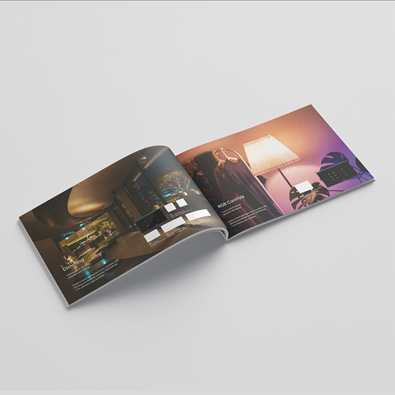
In order to begin with concrete concepts, it was necessary to break down what Toyama stood for and what it wanted highlighted for its current endeavours. The automation line it specialises in caters to homes, hotels and commercial spaces.
The aim of the rebranding was to continue to endear itself to its existing customer base with a hint of added reliability to its products and at the same time donning a new coat for what was to come in the future.
Having developed strategies for Branding, the client was advised to conduct a market research with existing customers spanning across regions and countries to connect, and elevate the functionality of their existing solutions. Having fulfilled this purpose, the next step by our team was to delve deep inside the heart of Toyama to pin an USP that spoke loud and clear in its branding elements. throughout the elements that ensured a smooth transition of the re-brand onto the market.
This prodded the team to keep in mind that what Toyama needed was to project itself as a futuristic, highly functional Indian brand. Another important aspect was to display its sincerity in creating spaces for emotional connections as well.
Symbolism to achieve Stakeholder involvement
It's important that each stakeholder of the company is well versed about the brand fundamentals so that it is known how to communicate with customers and represent the brand.
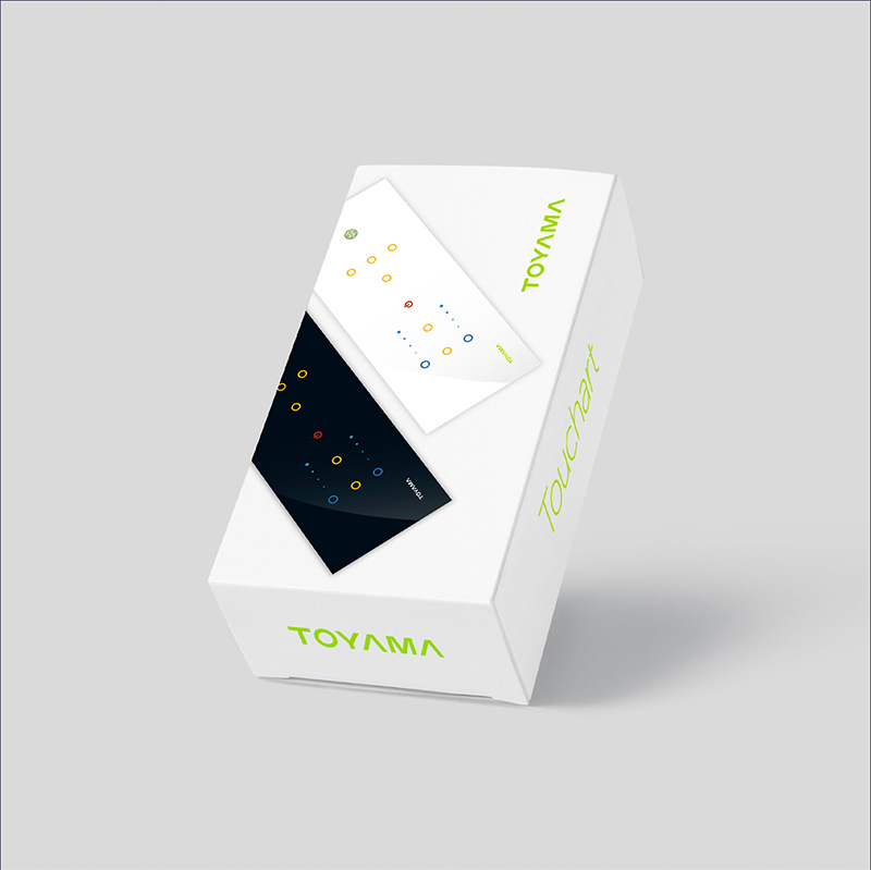
The use of a circle, derived from the letter ‘O’ in the Toyama Logo was a simple shot at describing the true nature of Toyama. As a primary design element, the circle was not only metaphoric of the company’s all-round development in all its ventures but also the most recognisable piece of Toyama, in association.
The final bits of the re-brand closed with prescribed brand guidelines to be followed as per occasion. Toyama’s new identity is now akin to its visual identity.
The final step - entering into social spaces. The strong and comprehensive language is to be used on their website, app and social media to spark brand recognition and remain perceptible to its competitors. Toyama will soon begin rolling out to a bigger market this summer
Discuss a
Project
Want to work with us on a project?
Drop a message, and we will get back to you.