
It’s always a surprise when something that we are so used to seeing or doing has changed. Sometimes we embrace the change and welcome it without a question and sometimes we don’t. Such has been the story of many brands and companies across the world. Change is a constant. Even in the entertainment industry, we see many television series make changes every season to catch up with the dynamically evolving world. One of the reasons we change things around is the need for freshness, a need to create something new. A need to free from the cycle of rut or boredom. One of the changes that is very evident in the world out there is the Facebook logo. You would find it interesting that such a change has happened over the past years, a few times. It is surprising when you track a company’s logo and read about its history and the changes.
Did you know that facebook’s famous logo started out as a face fogged by binary code? You’d wonder if it was one of the founder’s faces on it. Interestingly enough, it wasn’t. Andrew McCollum who was the classmate and a friend of Mark Zuckerberg designed the logo with the face of young Al Pacino in mind.
Also, another interesting fact is that what we now call ‘facebook’ was called ‘Thefacebook’ back in 2004.
After the local website meant for Harvard University gained popularity from other universities. And later to the public worldwide. The logo more or less remained the same with very subtle changes till date. This is because of the good old saying by John Hammond – character is the real foundation of all worthwhile success. In this case, it is the literal character. Jokes apart, as an established brand, people tend to recognize brands by their logo. And when that changes drastically, the brand becomes difficult to associate with, so try and keep it simple.
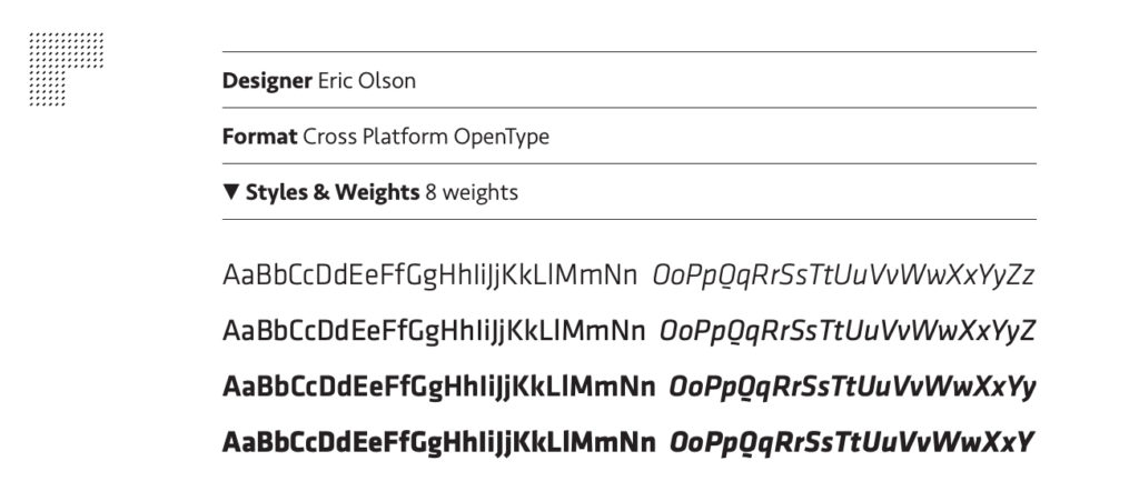
Mike Buzzard, facebook’s logo designer explains, that the facebook logo was a typesetting of the Klavika font designed by Eric Olson. Which means that the logo they made wasn’t something that they created from scratch. Rather it was a clever use of something that was already present. Quite a helpful tip if you are into designing logos.
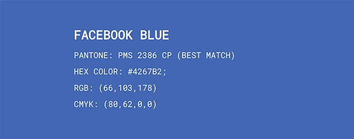
If you have seen or used the social networking website – facebook, you will notice that it is mostly filled with the colors blue and white. This was an intentional effort by the team so that Mark Zuckerberg, facebook’s founder could see the website clearly. Because he suffered from a condition called deuteranopia. Which is a condition where only the shades of blue appear to be of rich essence and clarity over others. And hence the colors stuck.
One helpful tip otherwise, is to use pastels and the color wheel when choosing colors for logo designs.
The iconic use of lowercase letters by facebook adds a casual vibe to it. The use of lowercase in logos generally portrays an attitude of approachability. People are more inclined to approach a brand logo written in lowercase as opposed to others. To name a few examples amazon, flipkart, citibank and ebay, they all have their branding in the lowercase.
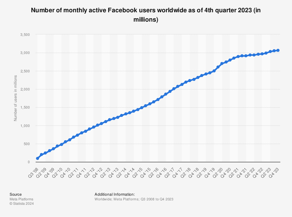
You may have already known this fact, but it is worth the mention. The facebook logo travels the world to nearly 2 billion people at least once a month. Which is approximately the population of the Americas and Africa put together. And, most of them see it every single day without a miss. Making it one of the easiest recognizable logos of the twentieth century.
The purpose of designing a logo is vital to understand if you need a simple or complex pattern. Be it for a small local firm or a global giant in the market, the need to design a logo will involve the purpose of the design. The design will vary depending on the purpose. Unlike other companies that spend tons of money on brand awareness and presence. The logo of facebook acts as a symbol for the company, so a simple typesetting design works in their case.
Change is good when people welcome it. Last year, we saw the corporate office of the social media giant facebook, change the logos of itself and other apps associated with it. Though it took time to get used to the new logos of Instagram and facebook. We should take note that the change wasn’t too hard. So sometimes, a minimalist rendering of the logo will make the cut and sometimes it doesn’t. However, an important pointer or tip, is that you ask questions. Because some clients will ask for a complete makeover and some will just want to change little aspects of the logo, and depending on their requirements, you can take a call. Asking questions of clarity to clients most often clears your doubts and presumptions to give your best. Some examples of rebranding are best expressed when the changes are minimal.
Finally, here is a little secret or fun fact. Did you know that the corporate logo of facebook has gone through some changes and made its way onto our smartphones? No, we’re not talking about its logo on the facebook App. But on WhatsApp and Instagram, if you haven’t figured it out yet. Next time you look at your phone to open these apps, pay attention to the start page of these apps.
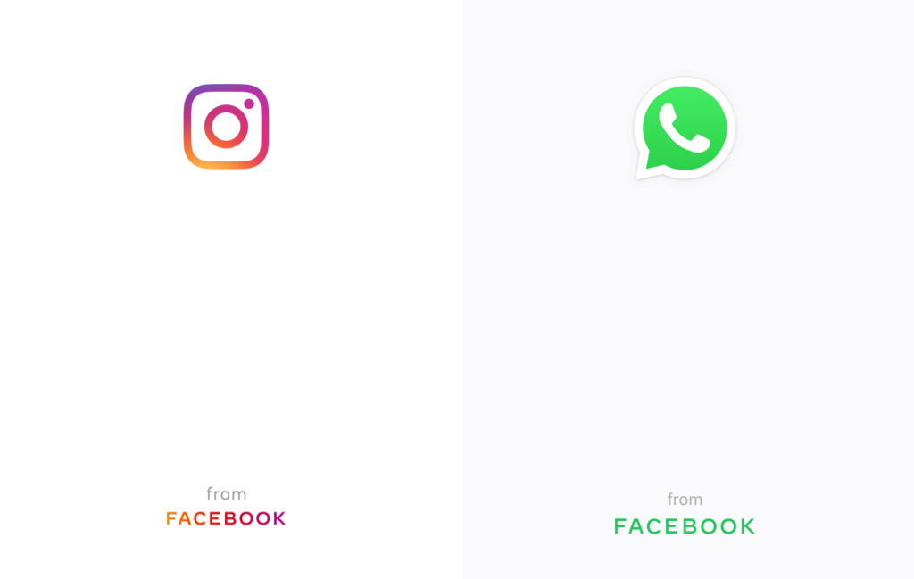
You’ll notice that a little facebook logo pops up at the bottom of the page. It’s a fun fact to brag about amongst your friends if they haven’t seen it already. Or even sound wise when you tell them that WhatsApp and Instagram are services owned by Facebook, Inc.