Delving into a different domain

Overview
When a well-known brand like Sunpure selling refined sunflower cooking oil, wheat flour, rice bran oil, and other products decides to diversify and delve into a completely different domain - offering luxurious residential enclaves - its branding has to be well-thought.


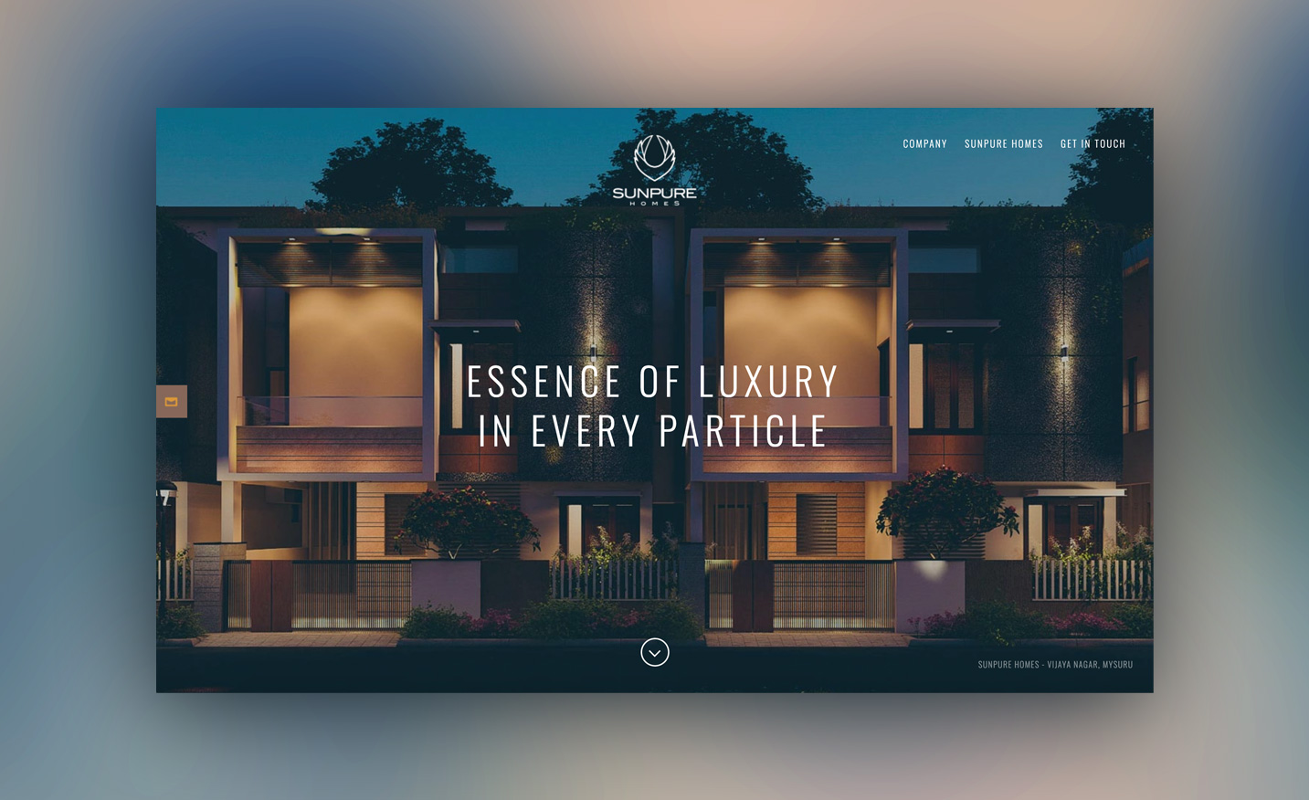
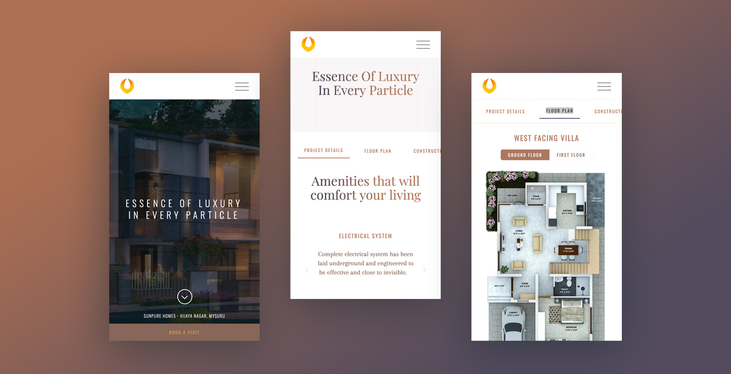
It was done to evoke a feeling of comfort and sophistication. The logo has colors of the ‘rising sun’, to depict a new beginning and good fortune. It looks like a ‘bird flying high’, with the wings symbolizing growth and strength. The negative space is in the shape of a drop, depicting something precious and pure, and also denoting what the brand has been famous for - oil. The alluring yet functional website design and other collaterals all made the brand stand out, and connect with its customers. To create a new experience, while keeping the values of the brand unchanged.
Wordpress
PHP
Javascript
Delivered
- Brand Identity Design
- Stationery
- Brand Manual
- Sales Brochure Design
- Website Design & Development
Discuss a Project
Want to work together on a project?
Drop us a message and we shall get back to you


