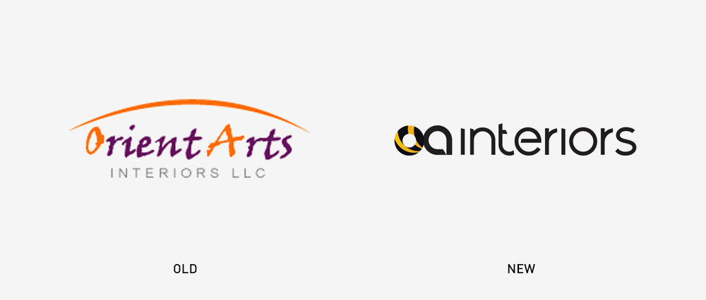
A company that specializes in planning and designing interiors, should have a well-planned and designed logo which appeal to their Target audience. Orient Arts Interiors, or OA Interiors as they are known in Dubai, UAE, realized this gap in their visual identity. When they began growing and bagging bigger clients, they felt their existing brand identity wasn’t matching up to the image they wanted to give out.
What were the brand values, and the qualities that OA stood for? Dedication, agility, passion, precision and teamwork. And what is that one thing in nature, known for all these qualities? A bee. What’s more, is that bees are also classic designers and architects. They make simple yet meticulous structures in nature.
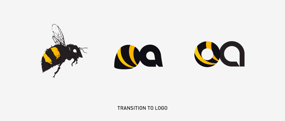
Aligning with this brand inspiration, we did their logo design. The letters O and A in the typography form the shape of a Honey Bee. A gradual & charming evolutionary transition from the bee to the logo is factored in, along with the usage of the colors black and yellow.

The concept of the brand’s new brochure was planned and designed as an extension of the brand identity. We know bees for their many admirable qualities. And the honeycombs they make for their meticulous planning and detail. So, four hexagons – honeycomb cells – were placed on the cover.

The patterned design on the stationery and other elements of the brand, was also inspired by a honeycomb. With many hexagonal cells stacked together, to form a design depicting stairs that lead upwards.
The whole rebranding process gave the brand a rejuvenated and contemporary look. This makes one realize that to find solutions to something, it is important to look into the branding strategy. In this case, it was the nature of the brand’s offerings and its values, which we utilized fruitfully.